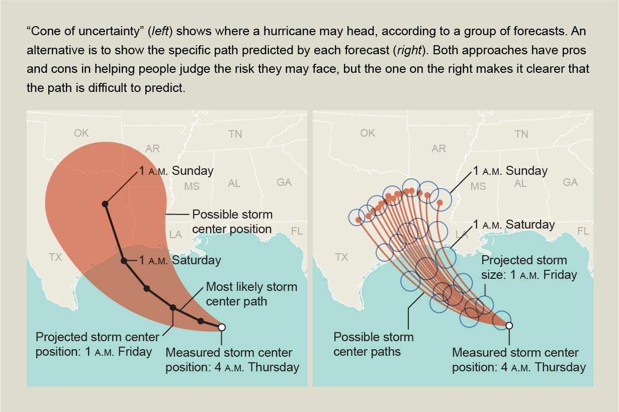
When tracking a hurricane, forecasters often show a map depicting a “cone of uncertainty.” It starts as a point—the hurricane's current position—and widens into a swath of territory the storm might cross in the upcoming days. The most likely path is along the centerline of the cone, with the probability falling off toward the edges. The problem: many people misinterpret the cone as the size of the future storm.
Researchers have found that the misunderstanding can be prevented if forecasters instead show a number of possible paths. Yet this approach can also introduce misunderstanding: lots of people think the probability of damage is greater where each path intersects land and less likely between the lines (maps).
Uncertainty pervades the data that scientists and all kinds of organizations use to inform decisions. Visual depictions of information can help clarify the uncertainty—or compound confusion. Ideally, visualizations help us make judgments, analytically and emotionally, about the probability of different outcomes. Abundant evidence on human reasoning suggests, however, that when people are asked to make judgments involving probability, they often discount uncertainty. As society increasingly relies on data, graphics designers are grappling with how best to show uncertainty clearly.
What follows is a gallery of visualization techniques for displaying uncertainty, organized roughly from less effective to more effective. Seeing how different approaches are chosen and implemented can help us become more savvy consumers of data and the uncertainty involved.
NO QUANTIFICATION
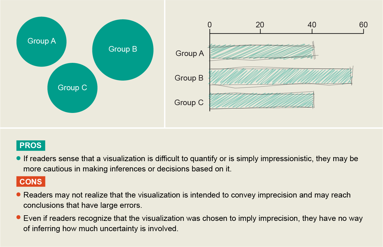
The least effective way to present uncertainty is to not show it at all. Sometimes data designers try to compensate for a lack of specified uncertainty by choosing a technique that implies a level of imprecision but does not quantify it. For example, a designer might map data to a visual variable that is hard for people to define, such as a circle floating in space (top) rather than a dot on a graph that has x and y axes. This approach makes the reader’s interpretation more error-prone. Alternatively a designer might use a program that creates a hand-drawn or “sketchy” feel (bottom). Both approaches are risky.
INTERVALS
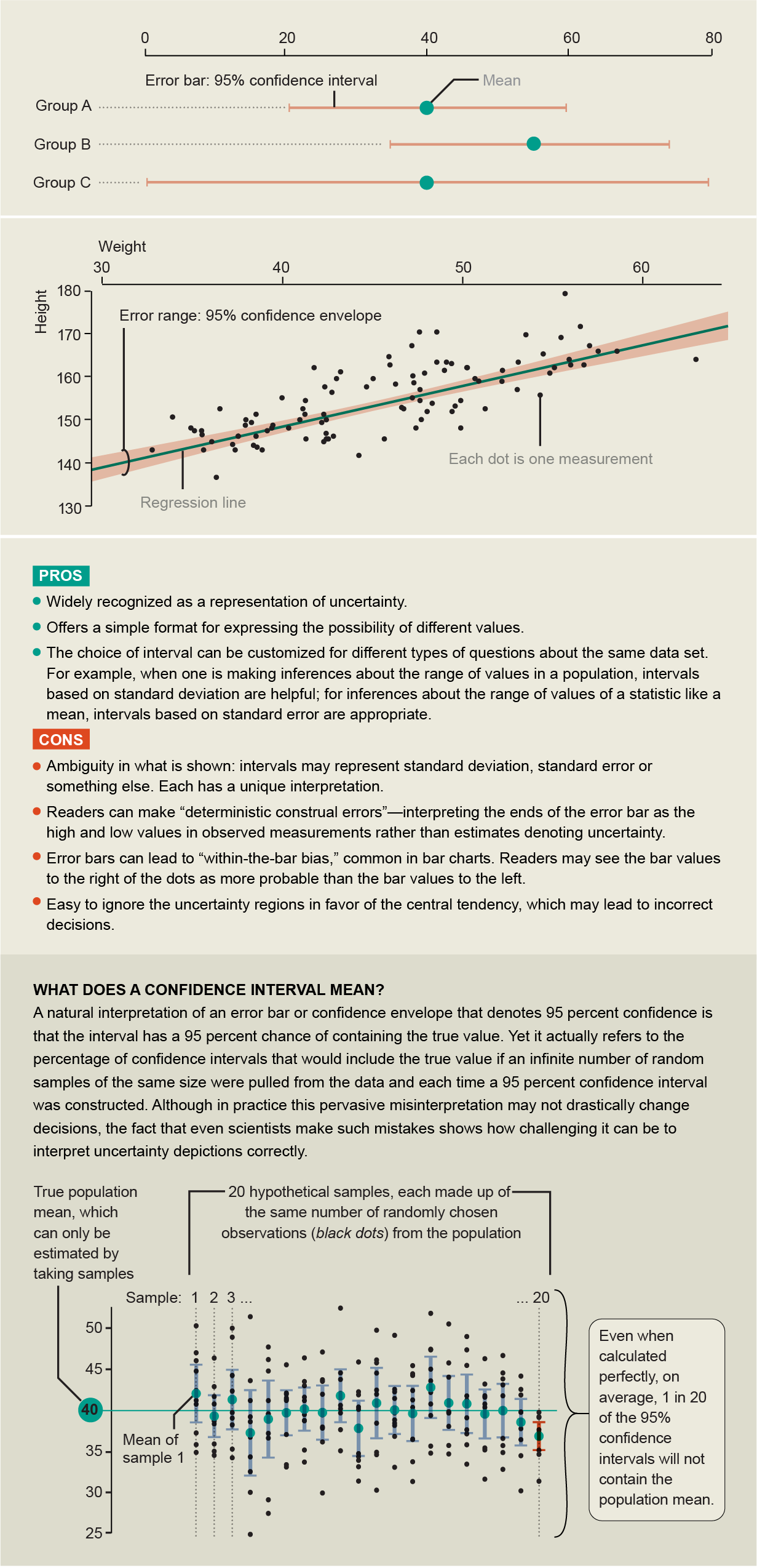
Intervals may be the most common representations of quantified uncertainty. Error bars (top) and confidence envelopes (bottom) are widely recognized, but even though they seem exact and straightforward, they are notoriously hard to interpret properly. Research shows they are often misunderstood, even by scientists.
PROBABILITY DENSITY MAPS
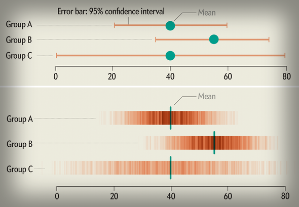
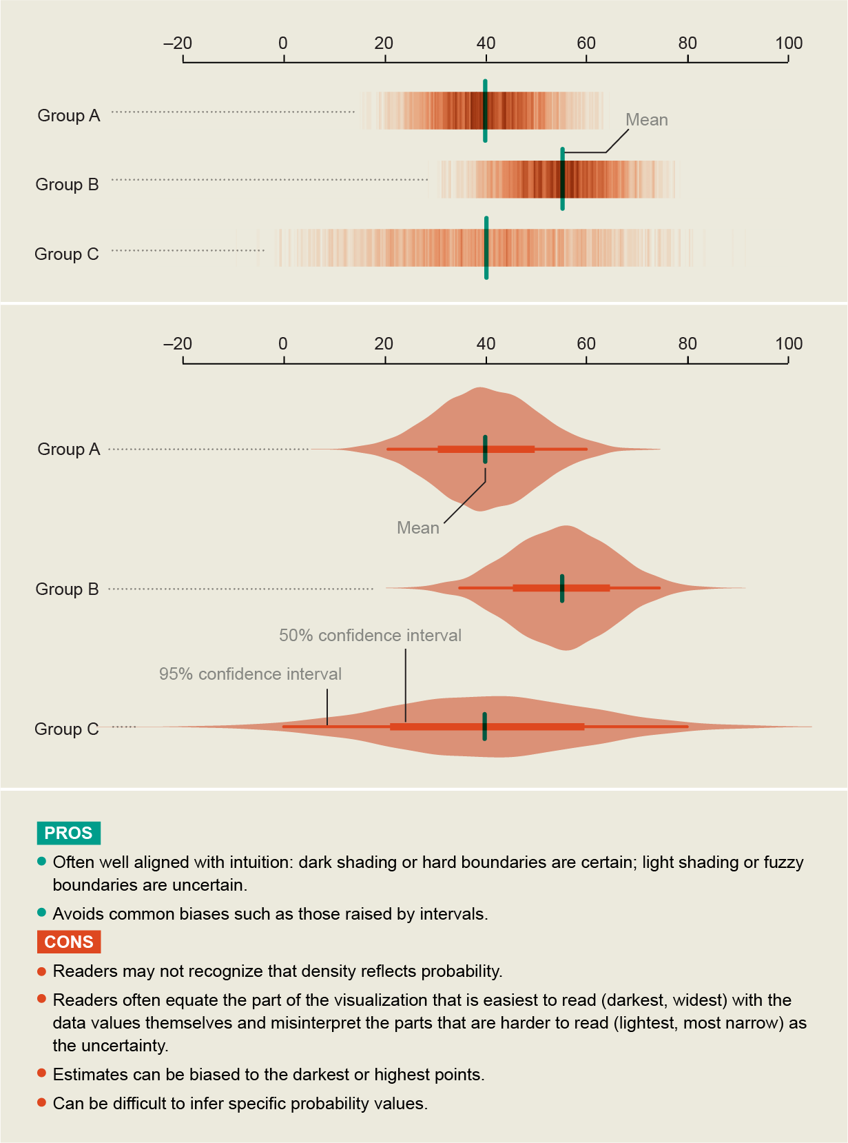
Designers can map uncertainty directly to a visual property of the visualization. For example, a gradient (top) plot can shift from dark color (high probability) at the center to lighter color (low probability) at the edges. In a violin plot (bottom), wider points mean greater probability. Mapping probability density to a visual variable displays uncertainty in greater detail than interval methods (error bars and confidence envelopes), but its effectiveness depends on how well readers can perceive differences in shading, height or other visual properties.
ARRAYS OF ICONS
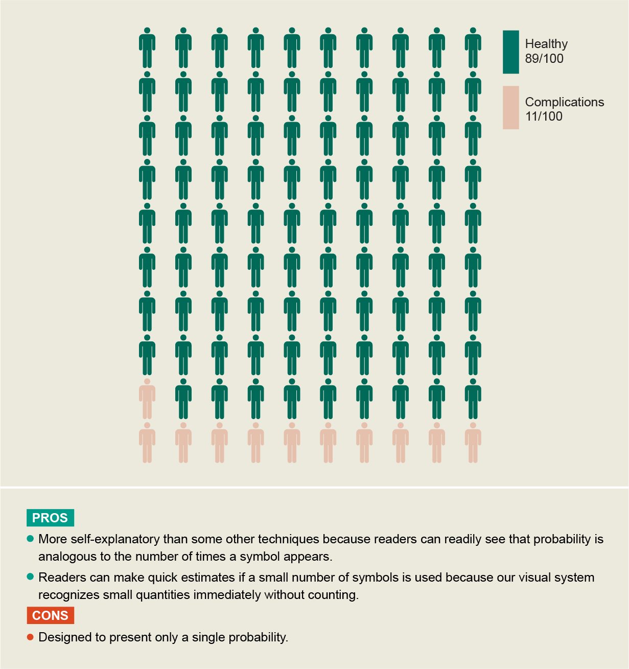
Reframing a probability such as 30 percent as a frequency—three out of 10—can make it easier for people to understand uncertainty and consequently use such information appropriately. People may better understand discrete probabilities because they run into them in everyday experiences.
MULTIPLE SAMPLES IN SPACE
Plotting of multiple samples in space can be used to show probability in a discrete format for one or more variable quantities. One example of this approach is a quantile dot plot. It shows a number of distinct cases from the quantiles of the data distribution, so that the number of dots (such as two dots high or five dots high, in the example below) conveys probability. When there is uncertainty about parameter values from which estimates are drawn, such as initial conditions, samples can be generated that vary these parameters and can be shown in a single visualization.
.png)
MULTIPLE SAMPLES IN TIME
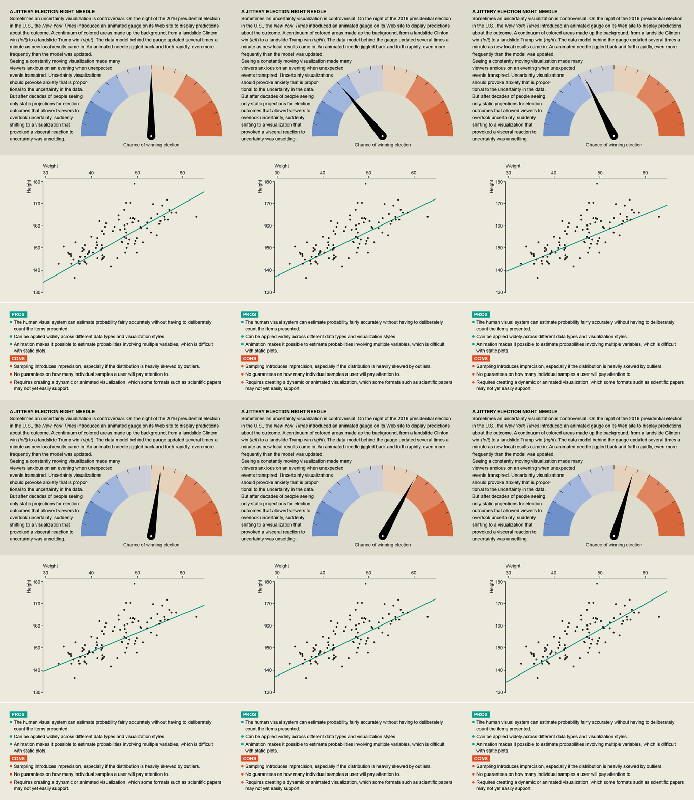
Plotting multiple possible outcomes as frames in an animation makes uncertainty visceral and much harder to ignore. This technique, called hypothetical outcome plots, can be used for simple and complex visualizations. Perceptual studies indicate that people are surprisingly adept at inferring the distribution of data from the frequency of occurrences: we do not necessarily need to count the number of times an event occurs to estimate its probability. One important factor is the speed of events, which must be fast enough so that people can see a sufficient number of samples yet slow enough for them to consciously register what they saw.
HYBRID APPROACHES
Designers can create effective uncertainty visualizations by combining different techniques rather than choosing a standard chart “type.” One example is a fan chart, made famous by the Bank of England (shown). It depicts data up to the present (left side of dotted line), then projections into the future; uncertainty about the past is an important component in assessing uncertainty about the future (right side). The fan chart presents probability from higher chance (dark shading) to lesser chance (light shading) in multiple bands that represent different levels of confidence, which the reader can choose from. Readers can perceive the information through the position of the edges of the bands, as well as lightness versus darkness. Some modern software packages for statistical graphics and modeling make it easy to combine uncertainty visualization approaches.
.png)
